Every week we get the same message at Creatsy, worded a dozen different ways: “Can you add a paper texture to this mockup?” “Can you change this fabric to linen?” “Can you make the surface look more textured?” Fair questions — and the honest answer is more interesting than people expect.
The short answer: mockup texture isn’t just a grain layer. It’s the way a material changes light, shadow, color, edge detail, and artwork distortion across a surface. A paper texture looks real when the grain, highlights, printed edge, and design blending were captured or rendered together. A fabric texture looks real when the weave, folds, stretch, and shadows move with the design. That’s why turning smooth paper into watercolor stock, or jersey into linen, is usually a rebuild rather than a quick Photoshop overlay.
In this guide, we’ll cover what mockup texture actually is, why it isn’t a one-click Photoshop filter, how photography-based and 3D-rendered mockups differ, what Smart Objects can and can’t do, and how to choose the right surface for your work.
What is mockup texture?
Mockup texture is the visible, physical-looking surface detail that makes a digital product preview read as real: the cotton grain of fine-art paper, the weave and folds of fabric, the matte finish of cardboard, the gloss on a label, or the soft shadow around a printed edge.
It’s not a decorative pattern sitting on top of the image. It’s how light, shadow, contrast, color, scale, and surface depth behave across the object.
That distinction matters because texture changes how your design looks, not just the background behind it. A semi-gloss paper sharpens color and catches crisp highlights. A rough cotton rag softens the same artwork and makes it feel handmade. Move your design from one material to another and the highlights, shadows, printed edges, and small imperfections all need to shift with it.
Why texture isn’t just a Photoshop effect
A texture overlay can fake a subtle grain, but it can’t recreate a real material on its own. Believable texture depends on several things working at once: the surface itself, the direction of the light, the shape of the object, the shadows and highlights, the scale of the grain, and the way the design follows the surface.
Change one and the rest has to follow. Drop a watercolor-paper grain over a smooth, evenly lit mockup and your eye catches the lie immediately (it’s the same set of tells we break down in why your mockup looks fake). The texture says “rough handmade paper” while the lighting still says “flat studio print.” The grain image can be beautiful, and the result still looks pasted on, because the light and shadows never got the memo.
Realism isn’t in the texture file. It’s in whether the whole scene agrees.
| Texture method | Best for | What it gets right | Main limitation |
|---|---|---|---|
| Photographed texture | Real paper, fabric, packaging, and product scenes | Natural grain, folds, edge detail, shadows, reflections, and imperfections | Less flexible after the shoot |
| 3D-rendered texture | Repeatable angles, material variants, products that don’t physically exist yet | Controlled lighting, roughness, bump, displacement, thickness, and repeatable camera positions | Can look synthetic if material scale, lighting, or surface behavior is wrong |
| Photoshop overlay | Tiny grain correction, subtle blending, or light surface noise | Fast visual adjustment | Can’t rebuild real shadows, folds, reflections, printed edges, or material behavior |
Photography-based mockups: texture from a real object
In a photography-based mockup, the texture is real because the surface was really photographed. If the mockup shows fine-art paper, the grain came from an actual sheet under studio lights. If it shows fabric, the folds and weave came from a real textile that was styled, lit, and shot.
We shoot most of our photography-based mockups in our own studio with Broncolor lighting, and the camera picks up things that are genuinely hard to fake: uneven surface structure, the soft falloff of a shadow, the thickness of a paper edge, a slight bend in a sheet, or a faint reflection catching the coating. Those small imperfections are exactly what makes a design look like it belongs on the product.
Photoshop comes in afterwards to make the file editable. Smart Objects, masks, blend modes, color layers, and adjustment layers help your artwork sit naturally in the scene. But the realism was banked before Photoshop opened: in the object, the material, the light, and the lens.
3D-rendered mockups: texture built digitally
Not every realistic mockup is photographed. Some are built in dedicated 3D software, where the texture comes from materials, geometry, lighting, and render settings rather than a camera.
A 3D paper surface can be built from roughness, bump, displacement, and thickness. A 3D fabric can use simulated folds and woven material detail to create softness and depth. A packaging mockup can combine paperboard thickness, label gloss, plastic reflections, metallic foil, or glass transparency in one controlled scene.
Done carefully, a render can be hard to tell from a photo, and it can do things a photo can’t: repeat the same angle perfectly, show a product before it exists physically, or create a full material family without reshooting every variation. The delivered PSD still behaves like a Photoshop mockup, with editable Smart Objects and organized layers. The texture just originated in the 3D scene.
To be clear, this isn’t Photoshop’s old built-in 3D workflow. Adobe notes that Photoshop’s legacy 3D features were removed in July 2024. If you’re opening an older Creatsy file that used 3D layers, here’s how we handle the Smart Object migration.
Photography captures a real surface. 3D rebuilds one. Either way, the texture has to be part of the surface, not floating above it.
Why paper mockups need real surface detail
Paper is the clearest example of why texture matters. A fine-art print mockup isn’t just a white rectangle with artwork dropped inside. The paper stock changes the entire read of the piece.
- Glossy paper makes color pop and edges feel sharp.
- Matte paper softens reflections and reads as calm and premium.
- Rough museum or watercolor paper adds visible grain and a handmade feel.
- Cotton rag gives artwork an archival, gallery-style softness.
- Canvas, acrylic, and aluminum each change edge detail, depth, and reflection in a different way.
For anyone selling prints (illustrators, photographers, poster designers, surface-pattern artists, print shops), this is the difference between a preview a buyer trusts and one they scroll past. A realistic paper mockup does the imagining for them: it shows how the artwork will sit on the stock before a single sheet is printed.
That’s why our Poster, Frame & Wall Art mockups are built around real presentation context: paper, frames, canvas wraps, gallery walls, room scenes, and styled surfaces that help artwork feel finished instead of floating on a blank background.
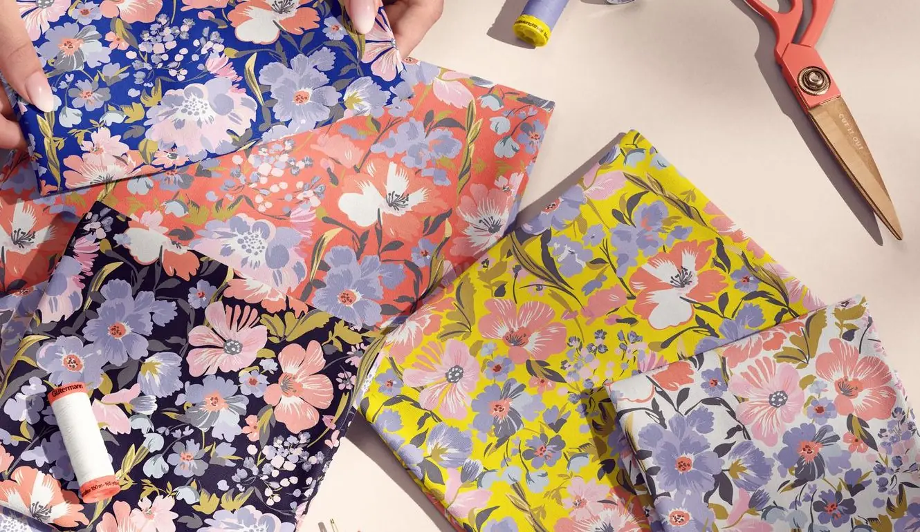
Why fabric mockups are harder
Fabric is tougher than paper because fabric is almost never perfectly flat. It bends, folds, stretches, and reacts to gravity, and your design has to ride all of that convincingly. A fabric mockup is about more than the weave you can see. It’s about how the cloth moves.
Different textiles behave differently, and the mockup has to respect that:
- Jersey is soft and flexible, with loose folds.
- Linen is natural and slightly irregular.
- Silk is smooth and reflective.
- Canvas is structured and heavier.
- Velvet absorbs light and reads deep and soft.
- Chiffon is light, sheer, and sensitive to layering and shadow.
Drape a fabric and the pattern needs to follow the waves of the cloth. If the print stays flat while the fabric bends, the whole thing collapses into something obviously fake. That’s also why swapping one fabric for another isn’t a quick edit: the folds, shadows, highlights, weave, stretch, and material behavior all have to change together.
If you work with textile design, pattern previews, or fabric branding, start with a surface that already matches your material. Our Fabric Mockups include cotton, linen, silk, satin, velvet, wool, denim, canvas, chiffon, and other textile surfaces made for pattern creators and fabric brands.
Why packaging texture changes the whole product story
Packaging has its own texture problem. A box, pouch, bottle, jar, bag, label, or wrap isn’t only a shape. It’s a material promise.
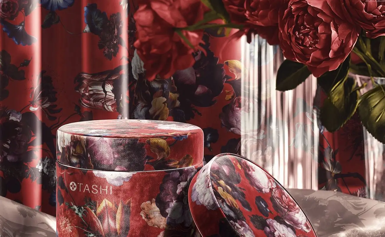
Kraft paper feels natural and tactile. Glossy plastic feels bright and retail-ready. Matte paperboard can make a brand feel calmer and more premium. Glass adds reflection and depth. Metallic foil behaves differently again, because it catches light before the viewer reads the design.
That’s why packaging mockups need more than correct perspective. The surface has to support the brand story. A coffee bag, cosmetic jar, label, pouch, or mailer box will only feel convincing when the material, highlights, shadows, seams, edges, and artwork blending are all working together.
For branding and product presentations, start with a material that already matches the final product. Our Box, Pouch & Packaging Mockups cover boxes, pouches, bottles, jars, coffee cups, paper bags, tubes, labels, wrapping paper, cardboard, kraft paper, plastic, glass, and metallic finishes.
Can you change the texture in a mockup?
Sometimes, a little. You can usually nudge contrast, add a touch of grain, shift color, soften or sharpen the design, or help artwork blend more naturally into the existing surface. Those are realistic edits.
Changing the material is a different job. Turning smooth paper into rough watercolor stock, jersey into linen, or matte packaging into glossy foil usually means rebuilding the surface logic of the file: highlights, shadows, texture scale, surface depth, artwork distortion, reflections, masks, blending, and sometimes the original photo or render itself. Miss any of those and the mockup can look fake, no matter how good the texture image is.
So the practical move is simple: pick a mockup that already matches the material and mood you want, rather than buying one and hoping to convert it into something else. It’s faster, and it actually looks right.
What Smart Objects can and can’t do
In a PSD mockup, a Smart Object is the editable artwork layer, set up to sit at the right scale, perspective, and placement. The Smart Object preserves your source artwork; the mockup’s masks, warps, shadows, highlights, reflections, and blend settings make it belong in the scene.
Edit the Smart Object, save, and the mockup updates — that’s the feature that lets you preview a design in seconds without rebuilding the file (the exact, repeatable steps are in how to put your logo in a mockup).
Here’s the limit people miss: a Smart Object places your design onto a prepared surface. It doesn’t replace the surface itself. If a mockup was built on real fine-art paper, your design can sit on that paper beautifully. If it was built on draped jersey, your design can follow that jersey. But if you want a fundamentally different material, no Smart Object will conjure it. The mockup has to be photographed, rendered, or rebuilt that way from the start.
How to choose the right mockup texture
Don’t shop by object alone. Shop by material. Before you download, ask:
- What am I actually showing: a print, a pattern, a package, a label, or a product scene?
- Should it feel soft, premium, natural, glossy, handmade, bold, minimal, or retail-ready?
- Does this surface support the story my design is telling?
- Will a buyer understand the final product better because of this material?
- Does the mockup already have the paper, fabric, packaging, or product texture I need?
- Will the design need to follow folds, seams, edges, reflections, or a curved surface?
If you sell fine-art prints, a textured paper or wall art mockup communicates quality in a way a flat preview never will. If you sell seamless patterns, a fabric mockup helps buyers picture the design on a real textile. If you design packaging, a realistic box, pouch, bottle, label, or jar makes your branding look market-ready.
The right surface reduces the buyer’s guesswork: they can see whether the artwork feels like a gallery print, a textile pattern, or finished packaging before they click through.
Start with the surface your buyer needs to imagine
If you’re not sure where to begin, match the mockup category to the buying decision:
| If you design… | Start with… | Why it helps |
|---|---|---|
| Posters, prints, illustrations, photography, gallery art | Poster, Frame & Wall Art Mockups | Shows paper, frame, canvas, wall, and room context so buyers can imagine the artwork as a finished piece |
| Textile prints, seamless patterns, fabric collections | Fabric Mockups | Shows weave, folds, stretch, drape, and material behavior instead of a flat pattern tile |
| Branding, labels, retail products, product concepts | Box, Pouch & Packaging Mockups | Shows how the brand behaves on real packaging materials, edges, seams, reflections, and product forms |
Why realistic mockups help sell design
A mockup is more than a presentation. It’s a sales tool. On an Etsy listing, a Creative Market preview, a Behance project, a client deck, or a Pinterest pin, a realistic PSD lets a viewer grasp the work instantly instead of straining to imagine it as a finished print, label, textile, or product.
That’s the whole reason surface detail earns its keep. Real texture adds context, reduces doubt, and builds trust. Trust is what turns a scroll into a click, and a click into a sale.
How Creatsy approaches texture
We build mockups for designers who notice the details, so texture is never an afterthought. Some of our files start as studio photography, others as 3D renders, but the goal is identical: make your design look like it genuinely belongs on the product.
Creatsy mockup PSDs are built as layered, high-resolution files with editable Smart Objects. The surface detail, printed edges, shadows, reflections, folds, and material behavior are integrated into the scene rather than dropped on top as a generic overlay. Check each product page for exact file specs, compatibility, resolution, and included views.
When you open a Creatsy mockup, you’re not placing artwork into a blank template. You’re placing it into a prepared, physically believable surface. That’s what makes a portfolio, a shop listing, or a client pitch look professional.
The takeaway
Realistic texture isn’t a filter you add at the end. It’s built into the surface, the light, and the shadows from the first frame or the first render. That’s why a great mockup makes your design look real instead of pasted on, and why it’s worth starting from a file whose material already fits your work.
FAQ
- What makes a mockup look realistic?
- A mockup looks realistic when the design matches the surface, perspective, lighting, shadows, reflections, and material behavior of the product. The strongest PSD mockups get this from careful studio photography or 3D rendering, then use Smart Objects, masks, and adjustment layers so your artwork blends into the existing scene.
- Is mockup texture just an overlay?
- Usually not. In professional mockups, the texture is part of the photographed or rendered surface, so it reacts correctly to light and shadow. An overlay can add light grain, but it can't recreate believable paper, fabric, or packaging on its own. The lighting, shadows, folds, edges, and reflections still have to match.
- Can I add paper texture to any mockup?
- You can sometimes add subtle grain, but adding a believable new paper material is much harder. Rough paper, watercolor stock, cotton rag, glossy paper, and canvas all change the way artwork, edges, highlights, and shadows behave. For the most convincing result, choose a mockup that was already photographed or rendered with the paper surface you want.
- Can I change the texture of a PSD mockup?
- Small adjustments, yes: contrast, subtle grain, color, and blending. Swapping the whole material is much harder, because the lighting, shadows, highlights, distortion, reflections, and surface depth all have to be rebuilt to match. For a clean result, choose a mockup already built on the material you need.
- How do I choose between a paper mockup and a fabric mockup?
- Choose a paper mockup when the final product is a print, poster, art reproduction, stationery piece, or framed artwork. Choose a fabric mockup when the design needs to be imagined as textile, clothing, pattern yardage, home decor, or a soft product. If the material changes how the buyer understands the work, choose the mockup that shows that material clearly.
- Why do paper mockups show different textures?
- Because different papers behave differently. Glossy, matte, cotton rag, rough museum stock, canvas, acrylic, and aluminum each reflect, absorb, or sharpen light in their own way. A glossy sheet can make color feel crisp; a cotton rag can soften the same artwork. A realistic paper mockup should show those differences rather than a single generic surface.
- Why are fabric mockups harder to edit?
- Fabric folds, stretches, and reacts to gravity, so a design has to follow the cloth instead of sitting flat. That movement, plus weave, shadow, stretch, and surface depth, is built into the file. Changing the fabric means redoing all of it, which is why fabric mockups are more complex than flat product mockups.
- What do Smart Objects do in a mockup?
- A Smart Object preserves your source artwork and lets you place it into the prepared mockup scene. In a PSD mockup, the file is set up so the Smart Object updates at the right scale, angle, and placement. It handles editability and placement, but it doesn't replace the underlying material or texture of the mockup.
- What should I check before buying a textured PSD mockup?
- Check whether the mockup already uses the material you need, whether the artwork follows folds or curved surfaces correctly, whether the file includes editable Smart Objects, and whether the product page lists the resolution, file format, compatibility, and included views. If texture is central to the sale, don't rely on a generic smooth mockup and hope to add the material later.
- Are Creatsy mockups photography or 3D?
- Both. Some Creatsy mockups use real photographed materials shot in our studio; others are built as 3D renders with digital materials and lighting. In each case, the texture is integrated into the surface so your design looks like it belongs on the product.