If you’re a brand designer, you know the feeling. You’ve spent weeks crafting a perfect identity system — logo, typography, color palette, iconography — and now you need to present it to your client in a way that makes them feel the brand. Not just see a logo on a white artboard. Feel it on a business card. On a letterhead. On a mug sitting on their desk.
That’s exactly where we were with MG Broker Biuro Nieruchomości, a real estate office in Poland going through a full rebrand. New name energy, new visual identity, new everything. The client needed to see their brand living and breathing on real objects before signing off. We used nineteen Creatsy stationery mockups to build the entire brand presentation. No photoshoots. No physical prototypes. No waiting three weeks for print samples. Just smart objects, our new design system, and an afternoon of focused work. Here’s exactly how we did it — and how you can do the same for your next branding project.
The client: MG Broker Biuro Nieruchomości
MG Broker is a real estate brokerage based in Poland, specializing in residential and commercial property sales. Like many local real estate offices, their existing brand identity had grown organically over the years — inconsistent logo usage, mismatched colors across print and digital, and a visual presence that didn’t reflect the quality of their service.
The brief was clear: create a modern, trustworthy brand identity that positions MG Broker as a premium real estate partner. The new identity needed to work across business cards, office stationery, signage, digital presence, and client-facing materials.
The new brand direction: a teal/mint-green palette paired with clean typography and generous white space. The color choice was intentional — teal communicates trust, stability, and sophistication without the corporate coldness of navy blue. Perfect for a real estate brand that wants to feel both professional and approachable.
The challenge every brand designer faces
Here’s the thing about branding projects that design school doesn’t prepare you for: the design is only half the job. The other half is the presentation. You can create the most beautiful identity system in the world, and if you present it as flat artboards in a PDF, the client won’t feel it.
Clients aren’t designers. They can’t look at a logo on a grid and imagine it embossed on a business card, printed on a letterhead, or wrapped around a coffee mug. They need to see it in context. On real objects. In real-world scenarios. The traditional options for showing this are:
- Physical prototypes. Expensive, time-consuming, and inflexible. If the client wants to change the green to a slightly darker shade, you’re starting over.
- A professional photoshoot. Beautiful results, but it costs thousands and takes weeks to coordinate. Overkill for a mid-project review.
- Canva or Figma templates. Quick but flat. They scream “template” and lack the photorealistic quality that makes a client say “yes.”
- AI-generated mockups. Fast but uncontrollable. You can’t place your exact logo — you get a beautiful image of someone else’s brand.
- PSD mockups with smart objects. Studio-quality photorealism, editable in seconds, infinite design iterations. This is what we chose.
Our solution: nineteen mockups, one cohesive brand story
We selected nineteen Creatsy stationery mockups that together tell a complete brand story. The selection wasn’t random — each mockup was chosen to showcase a specific aspect of the MG Broker identity system.
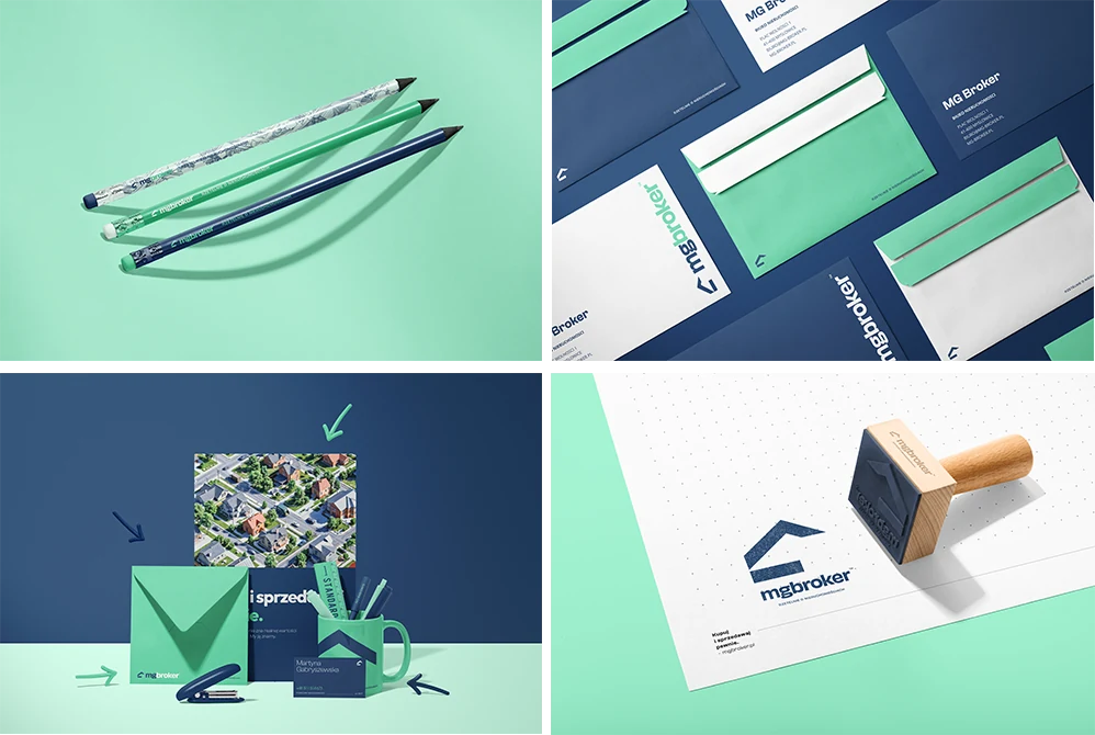
- Three Pencils Presentation Mockup — a clean, abstract scene that introduces the teal palette without overwhelming. The perfect opening slide.
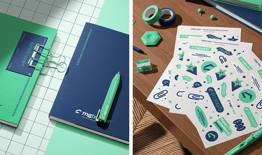
- Minimal Desk Scene with Notebook, Envelope, Mug and Business Card — the brand in an everyday office context; practical, professional, ready to be used by the team and clients.
- C5 Wallet Envelope Mockup Set — shows how the brand translates to physical correspondence. The client can imagine handing this to a buyer.
- Noissue Wooden Stamps Mockup — reimagined as a company stamp; a personal, tactile, trustworthy layer for marking documents and client materials.
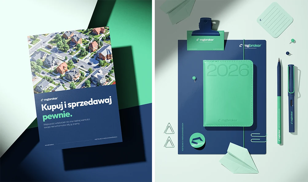
- Back to School Abstract Layout Poster Card — demonstrates the full type system: headlines, subheads, body text. Shows the brand voice in context.
- Leather Calendar with Folder and Business-card Mockup — leather texture + teal branding = trust and sophistication. The most “real estate” shot in the set.
- Planners and Plastic Blocks Mockup — used as branded planners (blocks removed to keep the scene clean); planning connects strongly to real estate decisions.
- Stickers Sheets and Stickers Mockup Set — for folders, envelopes, welcome packs and event materials; a friendly, memorable touch.
- PVC Glossy Poster Mockup Set — the brand as a premium printed material; a polished finish for office displays and client-facing communication.
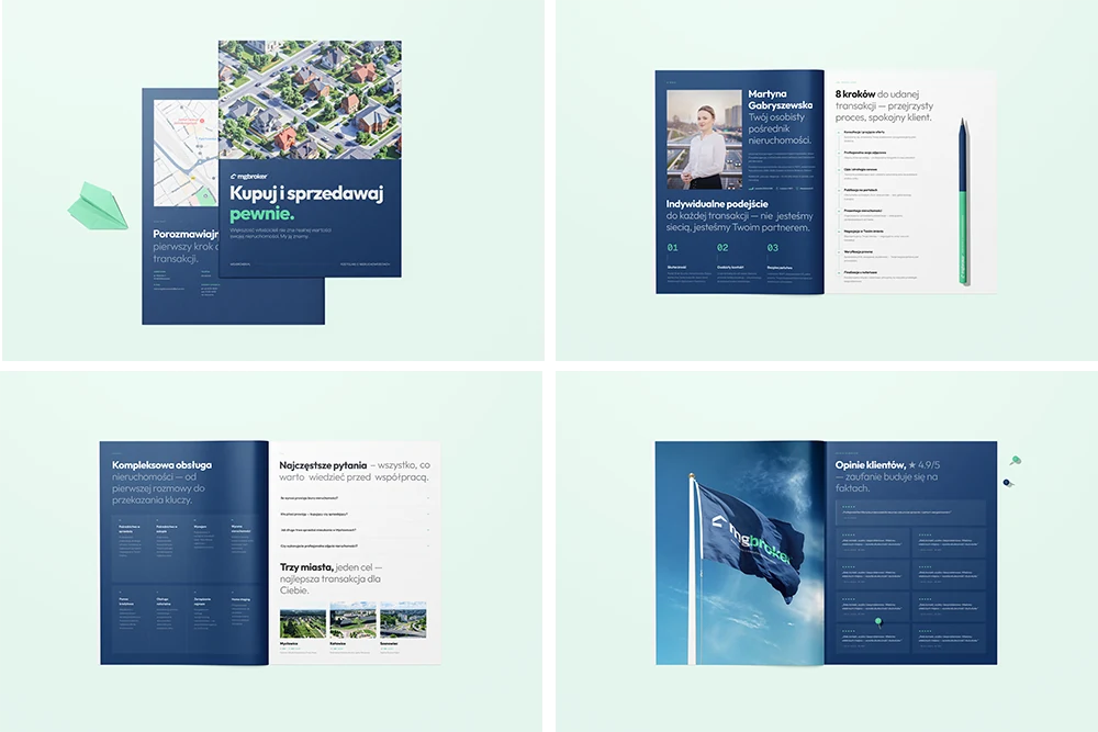
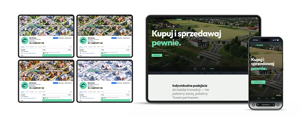
- 8.5×11 Magazine Mockup Set — treated as a company brochure rather than a magazine, showing how the brand works in an editorial, informative format for property insights and brand storytelling.
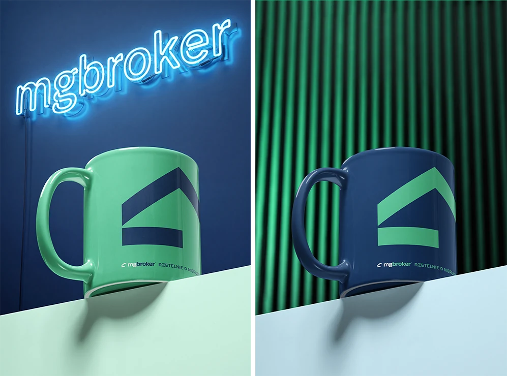
- Mug on Block Mockup Set — every office has mugs. Shows the client their team will use this brand every day.
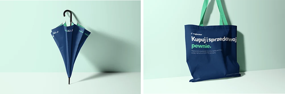
- Tote Bag Mockup Set (v.4) — extends the brand beyond the office; approachable and useful for events and everyday use.
- Umbrella Mockup Set — works practically and symbolically: protection, support, and guidance — exactly what clients want during a property decision.
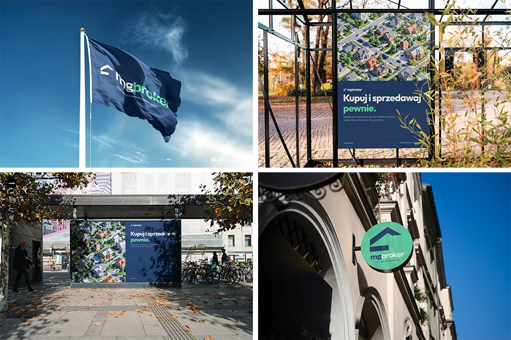
- Flag Mockup Set — proves the MG Broker logo stays recognizable even in a dynamic outdoor context.
- Round Signboard on Old Town Street Mockup — shows the identity working as a real, physical sign in the city.
- Urban Poster Banner Mockup (Autumn Scenery) — the brand in a busy urban environment, where communication needs to be instantly readable.
- Poster in Park Mockup (Autumn Scenery) — the brand in public space, demonstrating clear outdoor communication.
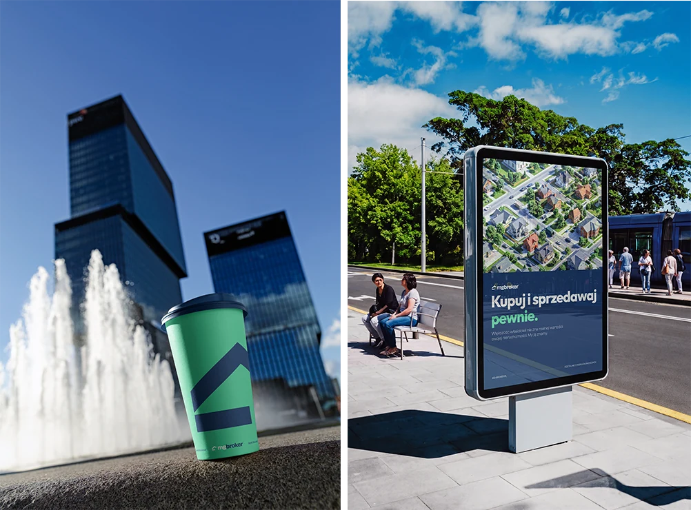
- Outdoor Billboard Poster Mockup — the campaign at a larger scale; proves the key visual, typography, and message stay strong from a distance.
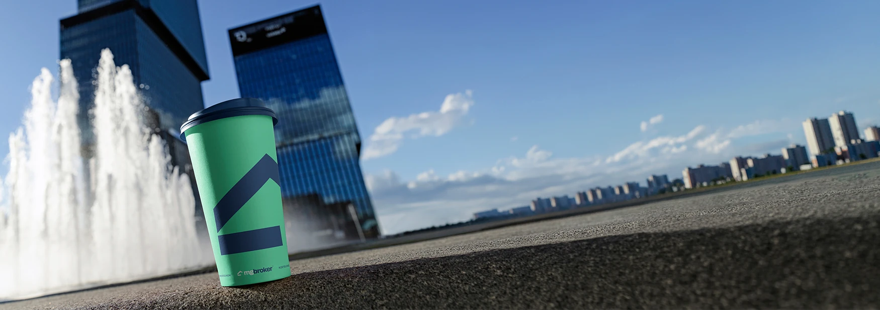
- Paper Cup Mockup Set (urban edition) — real estate is built around meetings and conversations; the paper cup makes the brand feel human and connected to daily city life.
Step by step: from design file to client presentation
Here’s the exact workflow we followed. This process works for any branding project, not just real estate.
- Export your brand assets first. Before touching any mockup, we exported every brand element as an individual file: logo (primary, secondary, icon), color swatches, typography samples, and pattern elements — everything at 300 DPI, CMYK for the print mockups.
- Choose mockups that tell a story. Start with something abstract and minimal, build through functional items (cards, notebooks, calendars), and finish with aspirational pieces (posters, large-format). Think of it as a brand-identity journey, not a random collection.
- Place your artwork in the smart objects. In Photoshop, double-click the smart-object layer, paste your design, save, and close. The mockup automatically wraps your art around the product with correct perspective, shadows, and lighting. Each mockup took roughly 3–5 minutes to customize.
- Customize the backgrounds to the brand palette. This is the pro move that separates amateur presentations from professional ones. We changed every background to match MG Broker’s palette — soft teal tints and warm neutrals. Creatsy mockups let you change background colors, surface materials, and object colors independently.
- Keep colors consistent across every scene. We used the same hex values (
#0D9488for the primary teal,#F0FDFAfor light backgrounds) across all mockups. Inconsistent greens across scenes would undermine the professional impression. - Export at full resolution and build the deck. We exported each mockup at full resolution (6000×4000px) and placed them in a presentation deck with minimal text. The mockups do the talking; we added only the brand name, brief context, and color/font specifications.
- Present with a narrative. During the meeting, we walked through each mockup explaining which brand element it demonstrates: “Here’s your logo on everyday stationery.” “Here’s how your brand looks at scale.” “Here’s what your team will see on their desk every morning.” Story, not just images.
Mockups aren’t just a presentation tool — they’re a closing tool. The right one at the right moment turns a concept into a commitment.
Why PSD mockups beat every alternative for brand presentations
We’ve tried every method for presenting brand identities to clients. Here’s why studio-shot PSD mockups consistently outperform the alternatives:
- Photorealism builds trust. Creatsy mockups are photographed in a professional studio with real lighting, real shadows, and real materials. When a client sees their logo on a leather notebook, it doesn’t look “mocked up” — it looks printed. That realism shortens the gap between concept and approval.
- Smart objects mean unlimited iterations. Client wants a darker green? A different logo placement? A serif font instead? Each change takes 60 seconds. No regenerating, no re-shooting, no starting over. This is the killer feature that AI and physical prototypes simply cannot match.
- Consistency across scenes. Every mockup in our MG Broker set uses the same brand colors, design assets, and visual language — impossible with AI generators (which produce a different “product” every time) and impractical with photoshoots (which require re-shooting for every change).
- Professional output without professional costs. A full presentation with photorealistic mockups cost us roughly two hours of designer time. The same quality from a photoshoot would require a photographer, stylist, props, studio rental, and two weeks of production.
- Reusable for future projects. The mockups we used for MG Broker are now part of our permanent toolkit. Every new real estate client, every new branding project — the same mockups, customized with a different brand. The cost per project drops to near zero.
Seven tips for mockup-based brand presentations
- Build a narrative arc. Don’t dump all the mockups on one page. Sequence them: start minimal, build to functional, finish with aspirational. Guide the client through a brand experience.
- Match backgrounds across all mockups. Nothing ruins a presentation faster than one mockup with a white background and the next with dark grey. Use consistent surface colors that echo your brand palette.
- Show your logo at different scales. Include both intimate close-ups (a business card) and large-format applications (posters, signage). This proves the brand works at every size.
- Include at least one “daily use” item. A mug, a notebook, a pen — something the client can imagine their team touching every day. This creates emotional attachment to the brand.
- Add context slides between mockups. Explain your choices: color rationale, typography-pairing logic, spacing rules. The mockups show; your notes explain.
- Export at maximum resolution. Present on the biggest screen available. Mockups at 6000×4000px look stunning on a 4K display; pixelated mockups destroy the illusion of realism.
- Prepare backup color variations. Before the meeting, pre-place 2–3 alternative palettes in the mockups. When the client says “can we try it in navy?” you pull up a pre-rendered version instantly. That responsiveness builds confidence.
The result
MG Broker approved the brand identity in the first presentation. No rounds of revisions to the overall direction. The client said they could “already see the brand” — which is exactly the point. When you present a brand on flat artboards, clients are evaluating a design. When you present it on photorealistic mockups, they’re evaluating a brand. That shift in perception is the difference between “let me think about it” and “let’s go.”
The total investment in mockup assets was a fraction of what a photoshoot would have cost, and the entire presentation was built in a single afternoon. Those same mockups will be reused on our next branding project — and the one after that.
The bottom line for brand designers
If you’re still presenting brand identities on white artboards, you’re making your work harder to approve.
Professional stationery mockups let you show — not tell — what a brand feels like in the real world. They’re faster than photoshoots, more flexible than physical prototypes, more realistic than Canva templates, and more controllable than AI generators. They’re the closest thing to showing a client their finished brand without actually producing it.
The MG Broker project proved something we’ve always believed: mockups aren’t just a presentation tool. They’re a closing tool. The right mockup at the right moment turns a concept into a commitment.
And if you work in branding and you’ve never tried mockups this way — start with a stationery set. Build one brand presentation. Watch your client’s reaction. You’ll never go back to flat artboards.
FAQ
- How many mockups do you need for a brand presentation?
- Enough to tell a complete story — for MG Broker we used nineteen, sequenced from minimal to functional to aspirational. The narrative arc matters more than the exact number.
- Are PSD smart-object mockups better than AI-generated mockups for branding?
- For client presentations, yes: smart objects place your exact logo with consistent perspective and lighting across every scene, while AI generators produce a different, uncontrollable product each time.
- How long does it take to build a mockup-based brand presentation?
- Roughly an afternoon. Each mockup takes about 3–5 minutes to customise once your brand assets are exported, and background colours change in seconds.
- Can the same mockups be reused for future clients?
- Yes — that is the cost advantage. The set becomes a permanent toolkit; you swap in a new brand per project, so the cost per presentation trends toward zero.